
Have you ever been shopping and noticed a particular color everywhere you turn? From tumblers to apparel to accessories, color trends start showing up everywhere..
This spring/summer 2021 season was certainly different given the current climate of socially distanced shopping, mask mandates, and work from home attire; however, this season’s collections are nothing short of inspiring.
Pantone released its color combo of the year - Ultimate Gray and Illuminating Yellow. A marriage of color conveying a message of strength and hopefulness that is both enduring and uplifting.
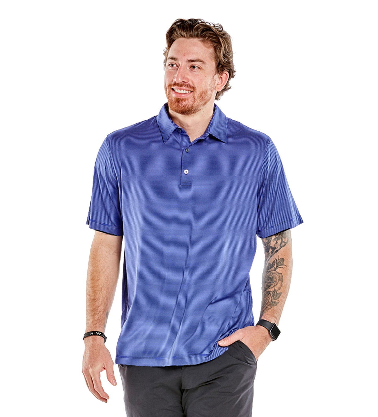
Other trends include pale and poppin’ pinks, vibrant oranges, and even tennis ball green. Storm Creek’s line is right on point with these trends.


But how did we get here? Who decides what colors infiltrate store shelves? Color forecasting is the practice of predicting the colors and color stories that will resonate with consumers, giving brands time to create the products their customers want.
Our Process
Creating a color story starts with our Senior Apparel Designer, Jeff Wright. First, research is conducted from resources like fashion publications, designer fashion shows, color trend services and the success (or failure) of colors in previous collections. Usually, trends will emerge in groups like pastels, jewel tones, brights, earthtones, etc.
“You’re trying to develop a color story to aid in merchandising. If the colors story works across many styles, it will look cohesive in a retail setting. This gives you the opportunity to give your customer a reason to have multiple deliveries of the same style they love,” Wright said.
When the decision is made to proceed with a particular color, the fabric supplier produces small swatches of fabric dyed in the requested color. This step is important to ensure consistent color across various fabrics prior to dying hundreds of yards of fabric.
What’s next for Fall
To look forward we have to look back. General colors stick around throughout an entire year, but tones fluctuate with the changing seasons. An example is the color yellow, much like Pantone’s. During the spring, yellow is bright and fresh to complement the natural world as it’s in bloom. By fall, the styles evolve into an earthy mustard yellow.
Last spring, Storm Creek crafted a pastel color story with dusty blue, sagebrush green, and pink blush. As we get closer to fall, the color story starts to evolve. Sagebrush green shifts to a blue-tinted glacier pastel and pink blush gives way to lavender and pale lilac. Going into the cooler months, the red-casted pink shifts to cooler purple tones.
“The most important thing to realize… color is evolutionary not revolutionary. If there’s a particular trend in color for fall, it will show itself again in spring with slight variations. A lot of fall is meant for cold weather and spring is for warm weather,” said Wright.

Jeff’s personal favorite color evolution is on The Pacesetter Sueded Jersey pullover. The style debuted in plum, berry, teal, sky, mocha and mushroom in the fall of 2019. Since then, the style has evolved from cool jewel-tones to pastels - and coming this fall complementary pastels with a pop of color.
Next time you’re strolling the aisles or scrolling online see if you can pick out the next color trends.